


Related works

Cambridge School
It's branding, omg!

Ready for people
Teamwork

Brasería Milana
Grill thrills
Branding
Corporate identity
Logo design
Visual communication
Art direction
Sales material
Web design
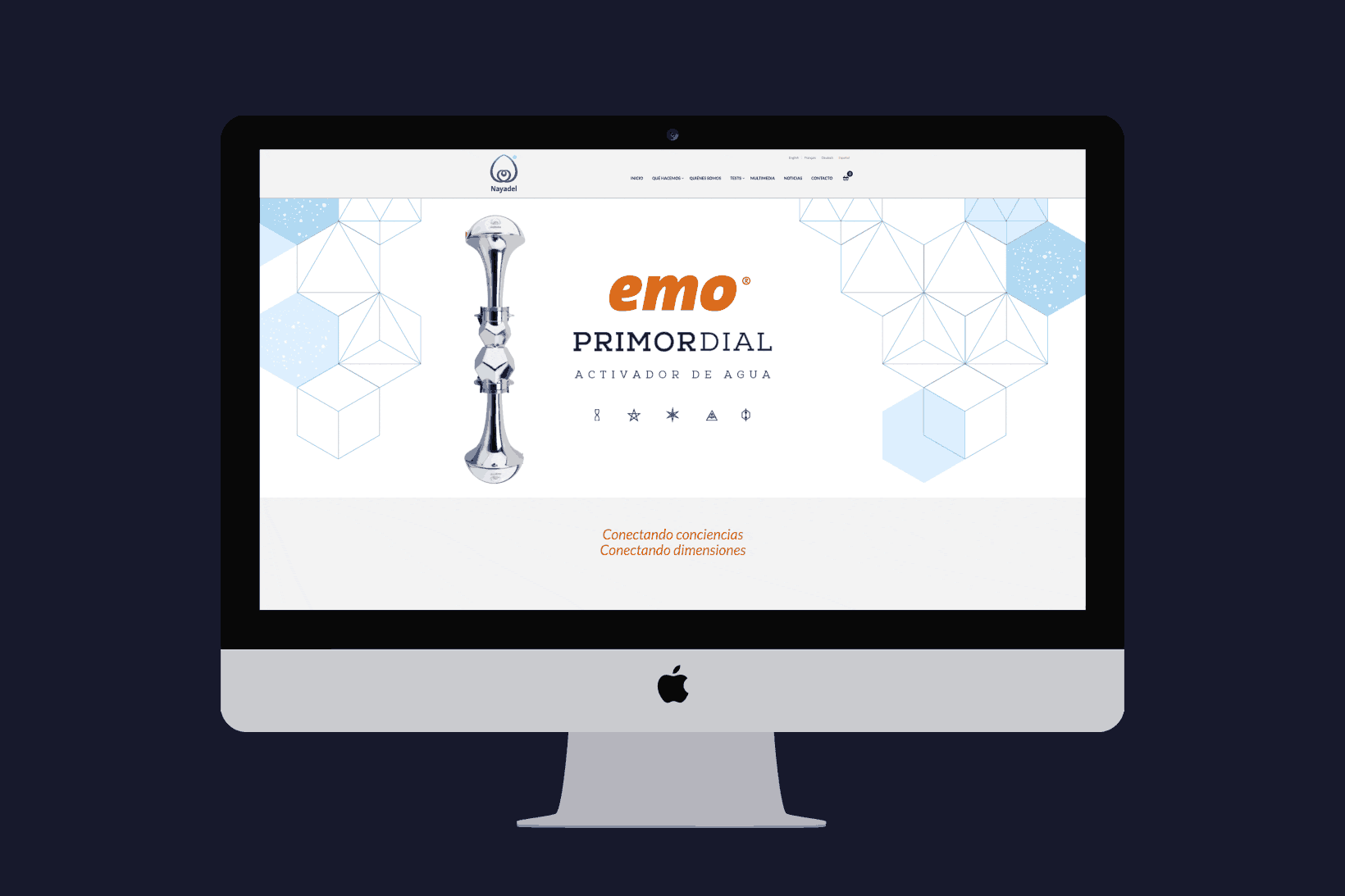
Origin — Nayadel is a company that develops products for connecting the individual and the environment through vibrational mechanisms, natural elements and mathematical geometries – all from a holistic perspective. They sell water activators, space and energy harmonizers, consciousness amplifiers and connectors as well as protectors against harmful electromagnetic radiation.
This is a corporate identity commission in which harmony, a steady hand, proportion, composition and visual balance were crucial.
The task we were asked to perform was to design the logo and create all the brand’s imagery based on certain indications: work with shapes and visual references from the universe of living technologies, create a balanced and descriptive emblem and, especially, use the golden ratio in the process.
Balance — The result is a logo that refers to forms and concepts representative of energy philosophy: to the lotus flower, which stands for spiritual purity; to a fruit and its seed, which is a symbol of life, or to two hearts (inner and outer) connected by the energies that go from one to the other.
The design also shows a double wave based on the famous Fibonacci sequence (the divine proportion) and also refers to a Nayadel constant: water.The corporate colour chosen was an “electric” blue that, in effect, refers to the energies handled by the Nayadel devices and is the colour of water, the colour of the sky, the colour of life.
Once finished, the logo underwent a study to check that its properties were harmonious and energetically balanced, that it was in line and there was connection.
| Cookie | Duration | Description |
|---|---|---|
| ARRAffinity | This cookie is set by websites that run on Windows Azure cloud platform. The cookie is used to affinitize a client to an instance of an Azure Web App. | |
| cookielawinfo-checbox-analytics | 11 months | This cookie is set by GDPR Cookie Consent plugin. The cookie is used to store the user consent for the cookies in the category "Analytics". |
| cookielawinfo-checbox-functional | 11 months | The cookie is set by GDPR cookie consent to record the user consent for the cookies in the category "Functional". |
| cookielawinfo-checkbox-advertisement | 1 year | The cookie is set by GDPR cookie consent to record the user consent for the cookies in the category "Advertisement". |
| cookielawinfo-checkbox-necessary | 11 months | This cookie is set by GDPR Cookie Consent plugin. The cookies is used to store the user consent for the cookies in the category "Necessary". |
| cookielawinfo-checkbox-performance | 11 months | This cookie is set by GDPR Cookie Consent plugin. The cookie is used to store the user consent for the cookies in the category "Performance". |
| PHPSESSID | session | This cookie is native to PHP applications. The cookie is used to store and identify a users' unique session ID for the purpose of managing user session on the website. The cookie is a session cookies and is deleted when all the browser windows are closed. |
| viewed_cookie_policy | 11 months | The cookie is set by the GDPR Cookie Consent plugin and is used to store whether or not user has consented to the use of cookies. It does not store any personal data. |
| wp-wpml_current_language | 1 day | Web language |
| Cookie | Duration | Description |
|---|---|---|
| player | 1 year | This cookie is used by Vimeo. This cookie is used to save the user's preferences when playing embedded videos from Vimeo. |
| sp_landing | 1 day | This cookie is set by the provider Spotify. This cookie is used to implement audio content from spotify on the website. It also helps in collecting information on user interaction with this audio content. |
| sp_t | 1 year | This cookie is set by the provider Spotify. This cookie is used to implement audio content from spotify on the website. It also helps in collecting information on user interaction with this audio content. |
| Cookie | Duration | Description |
|---|---|---|
| _ga | 2 years | This cookie is installed by Google Analytics. The cookie is used to calculate visitor, session, campaign data and keep track of site usage for the site's analytics report. The cookies store information anonymously and assign a randomly generated number to identify unique visitors. |
| _gat_UA-79013542-1 | 1 minute | Google Analytics |
| _gcl_au | 3 months | This cookie is used by Google Analytics to understand user interaction with the website. |
| _gid | 1 day | This cookie is installed by Google Analytics. The cookie is used to store information of how visitors use a website and helps in creating an analytics report of how the website is doing. The data collected including the number visitors, the source where they have come from, and the pages visted in an anonymous form. |
| vuid | 2 years | This domain of this cookie is owned by Vimeo. This cookie is used by vimeo to collect tracking information. It sets a unique ID to embed videos to the website. |